I worked closely with One Simple Plan’s designers to lead creative direction and graphic ideation that supported Pryes Brewing’s brand identity and social strategy.
See below for examples of the creative direction I provided and how the design team brought it to life.
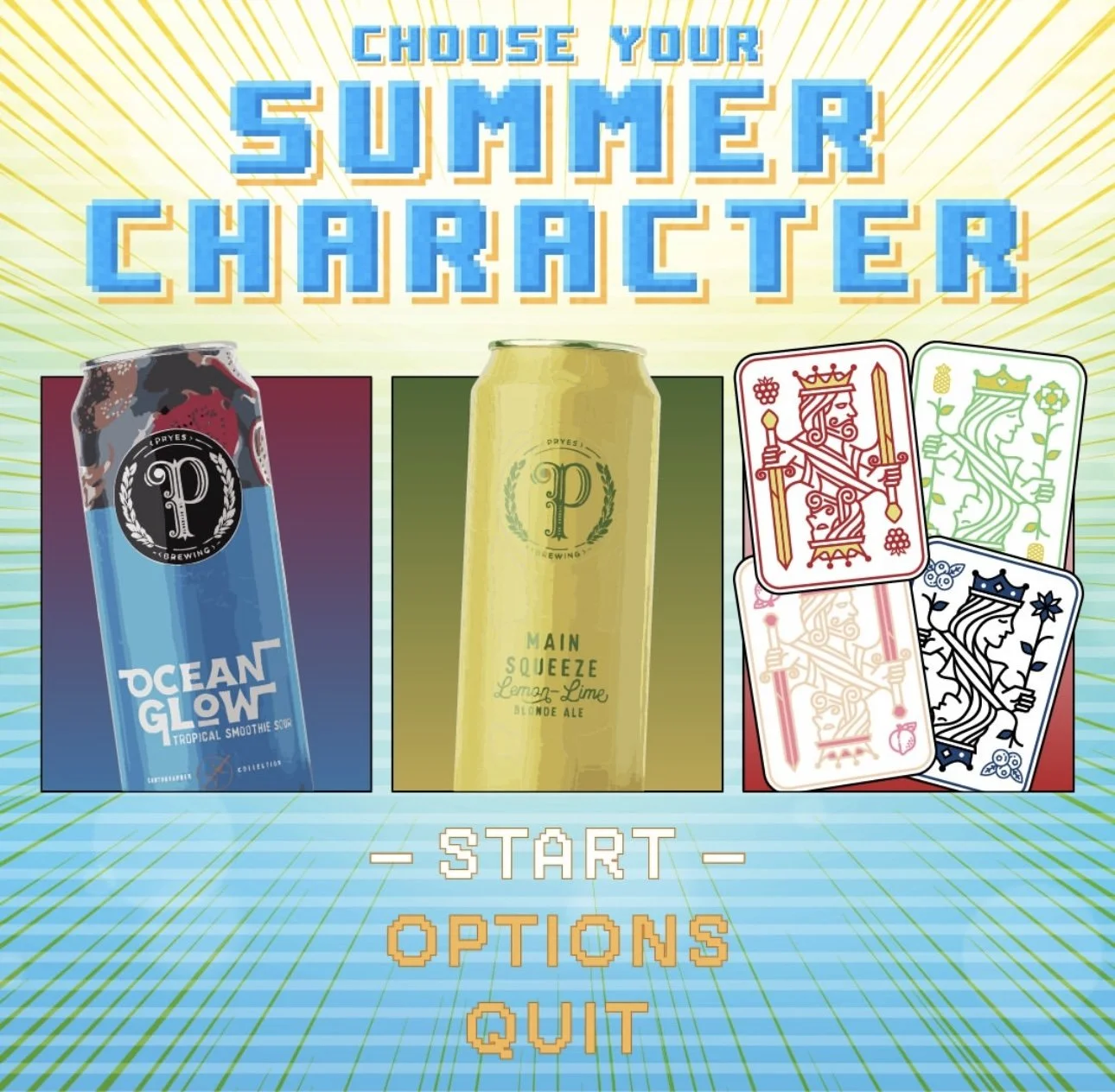
Creative Brief
This is a fun “Pick Your Character”-style series. The concept includes one introductory graphic and three character-style graphics, each showcasing one of our seasonal beers. This is a game-style “Choose Your Summer Character” visual, where each beer is a unique character with flavor traits and a special move. It is bright, playful, and packed with personality.
Slide 1: Intro Graphic:
Headline: “Choose Your Summer Character”
Set the tone for the series - light, summery, and stylized like a video game character select screen.
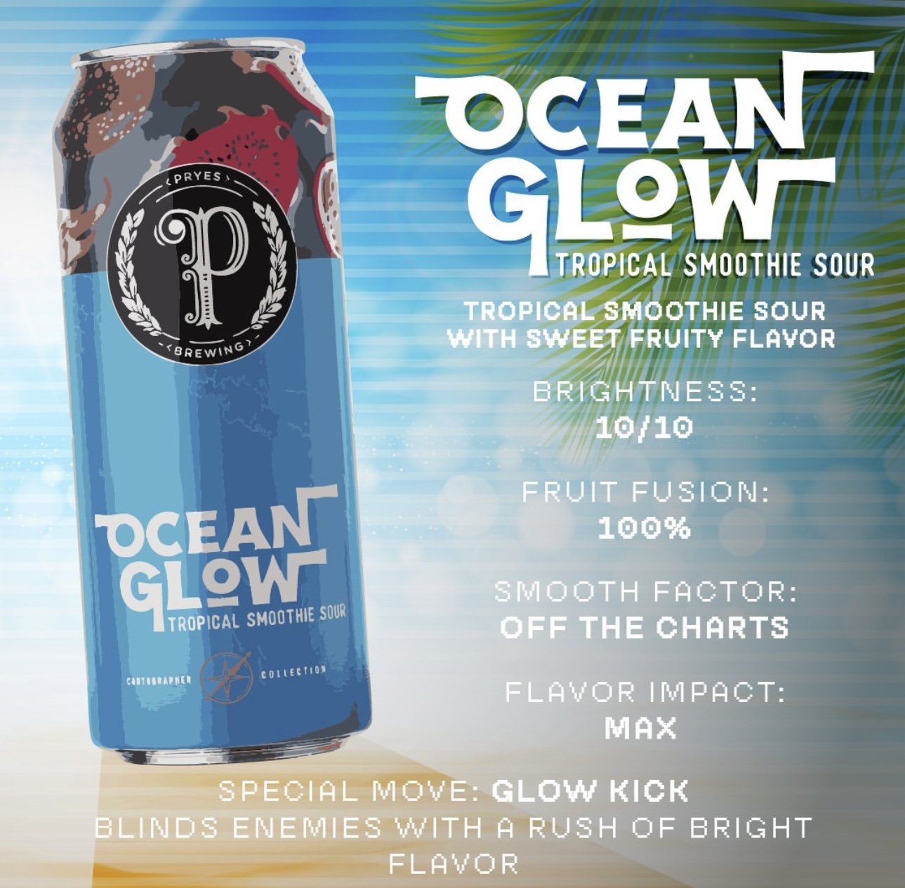
Slide 2: Ocean Glow
Aesthetic: Tropical beach vibes- palm trees, bright colors, and smoothie-style energy
Flavor: Tropical smoothie sour with sweet fruity flavor
Stats:
Brightness – 10/10
Fruit Fusion – 100%
Smooth Factor – Off the Charts
Flavor Impact – Max
Special Move: Glow Kick – Blinds enemies with a rush of bright flavor
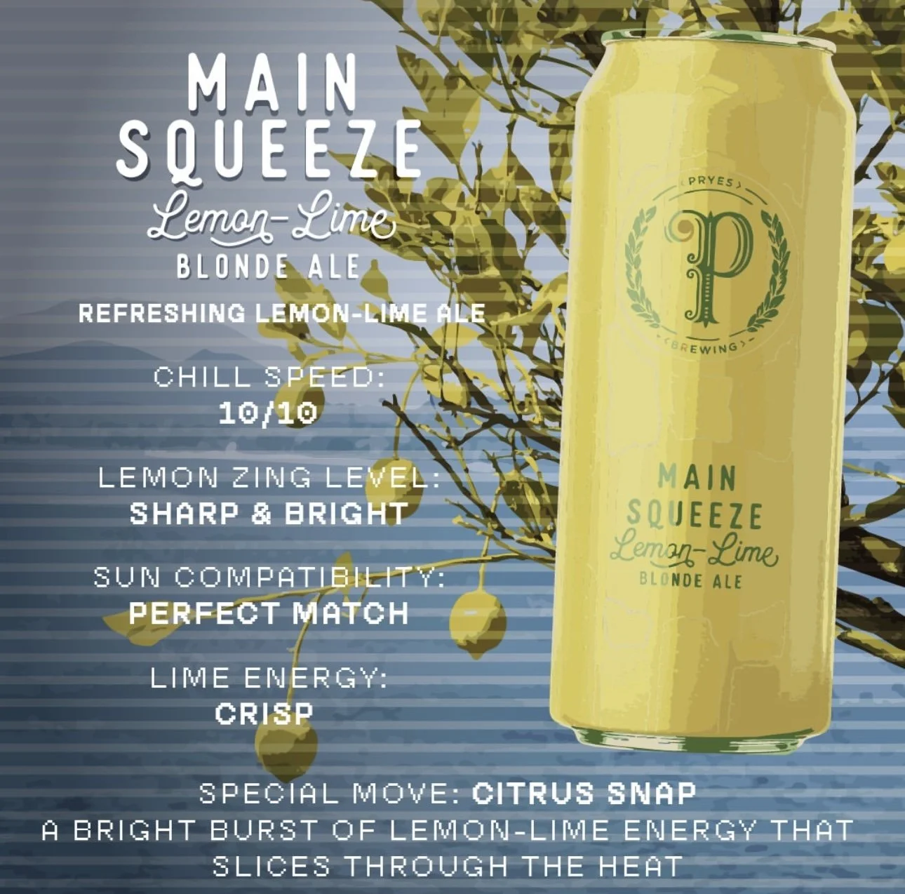
Slide 3: Main Squeeze
Aesthetic: Clean yellows and greens with lemon and lime elements
Flavor: Refreshing lemon-lime ale
Stats:
Chill Speed – 10/10
Lemon Zing Level – Sharp and Bright
Sun Compatibility – Perfect Match
Lime Energy – Crisp
Special Move: Citrus Snap – A bright burst of lemon-lime energy that slices through the heat and stuns thirst instantly.
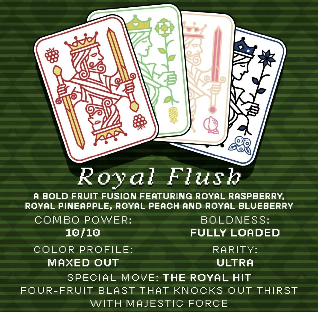
Slide 4: Royal Flush
Aesthetic: Play on a Royal Flush playing card, using summer colors like orange, pink, yellow, and blue to represent raspberry, pineapple, peach, and blueberry
Flavor: A bold fruit fusion featuring Royal Raspberry, Royal Pineapple, Royal Peach, and Royal Blueberry
Stats:
Combo Power – 10/10
Boldness – Fully Loaded
Color Profile – Maxed Out
Rarity – Ultra
Special Move: The Royal Hit – Four-fruit blast that knocks out thirst with majestic force
Creative Direction
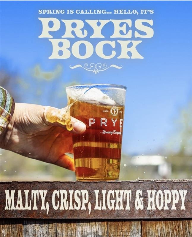
A high-quality photo of the beer in a glass against the blue sky with text graphics calling out the key flavors and elements.
Bright, warm, and inviting with an aesthetic that highlights the rich, golden color.
Text copy:
“Spring is Calling…Hello it’s PryesBock”
“Malty, crisp, light & hoppy”
See example below:
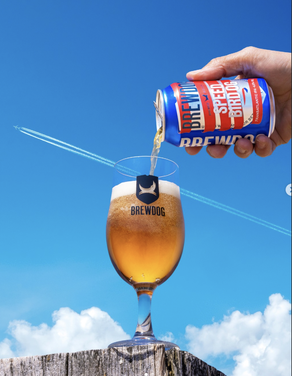
Strong product focus with clear contrast against the background.
The hand placement adds energy and creates a dynamic feel.
This example doesn’t include text, but incorporating varied font sizes could better draw attention to the name “PryesBock.”